-
Architects: KARABON
- Area: 3150 m²
- Year: 2016
-
Photographs:Mehdi Panahi
-
Manufacturers: Miele, Azarakhsh Brick, Bms, Galletti, Kohler, Namikaran, Nobilia, SET, Sang Saphir Sepahan, VALVO
-
Lead Architect: Mehdi Panahi
-
Structural Design: Sabzi, M.A Panahi

Text description provided by the architects. In the past, the living of human beings has been beside nature, but nowadays due to the definition of architectural space for living in floors above the ground, this relationship has been almost gone. Also In the past 40 years, the greenery of the urban landscape in north Tehran gradually has been missed under continuous constructions. The main idea of this project was formed through an attempt to find an approach in making the relationship with nature stronger both physically and visually.

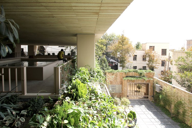
In the project design process, wherever it was possible to create a green area, an appropriate detail was designed according to the limitations and criteria. Generally, except for living spaces and circulation paths, all other surfaces designed to maximize green spaces in the form of large and small flower boxes. The most important of these areas are courtyard, roof garden, and split-level yard above ground floor parking.

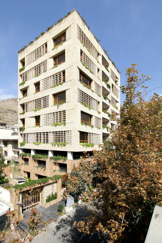
Along with the main concept of the project, the Facade design idea was formed to outspreads the facade surfaces opened following two important issues: one view and landscape, and the other creating a suitable area for greenery growth. This opened-facade designed to provide greenery growth gradually toward the widest grid of facade, on the one hand by distancing finishing shell from main body of the building and on the other hand by making the grids of finishing shell of the facade, wider and wider and like was gradually rotating the elements of facade to minimize coverage. At the end of this opened-shell of bricks, the maximum gap was created between the bricks to allow more visibility and create more space for greenery. The facade details and its combination with the plants make a similar sense on both sides of the shell. These details are an attempt to make closer the sense of inside and outside. In order to execute these details, we choose brick as the main material because of its modularity and possibility of alignment likewise having a powerful and familiar sense.


Split-level courtyard – the effect of the main idea. Due to the steep slope of the street, there was 5 meter height between ground-floor parking level and first floor level, while the height required for parking was 2.4 meter, along with the main concept of the project, we designed Split-level to make a green floor, aiming to increase green spaces of the project. Access to this space is provided exclusively by a bridge from the lobby. Finally, in all over the project, wherever planting was possible, flower boxes designed to increase green space and plant diversity. We used the smart watering system to keep the plants always fresh and green even in the absence of residents.


